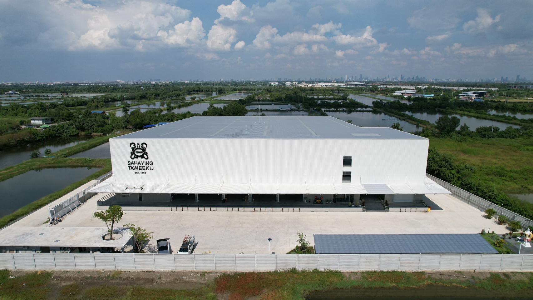
WORK

Luckyware Warehouse

Samutprakarn — Thailand

Luckyware Warehouse

Samutprakarn — Thailand

At Warehouse No.3 the entrance appears modest from the outside. However, once inside, the space opens up dramatically with a triple-height, 10-meter-tall atrium that enhances the sense of openness. This design connects the storage areas with the three-story office zone, offering a seamless flow between spaces. The simple, functional layout creates an unexpected spatial experience, reflecting the warehouse’s dual role as both a storage facility and a showroom.

Location :

Samut Prakan,Thailand

Year :

2022-2023

Team :

Design Team :

Veerasu Sae-Tae
Punchok Puangkham

Structure & Project Manager :

Meechai Chairitnukul

Status :

On-going interior design

โกดังสาม: จากพื้นที่เก็บของสู่โชว์รูม

โกดังสาม เป็นชื่อที่เหล่าคนงานใช้เรียกโกดังเก็บของแห่งนี้อย่างไม่เป็นทางการ แม้ว่าชื่อที่เราอยากตั้งให้จริงๆ คือ “ลัคกี้แวร์ HQ” ต้องยอมรับว่าภาพอนาคตของบริษัทที่เราเห็นในใจนั้นดูยิ่งใหญ่เกินกว่าสถานการณ์ปัจจุบันอยู่มาก ห้างหุ้นส่วนจำกัดสหยิ่งทวีกิจ และบริษัทลัคกี้แวร์ จำกัด คือสองบริษัทในเครือเดียวกันที่ทำงานอยู่ในพื้นที่เดียวกัน
 
ครั้งนี้เป็นครั้งที่สองที่ผมเข้ามาดูแลและออกแบบโกดังให้กับบริษัท ผ่านกระบวนการออกแบบไม่มากก็น้อย มันก็ทำให้เราซึมซับ ปัญหาทางโครงสร้าง ของบริษัทและเริ่มเข้าใจ ฟังก์ชันของโกดัง ในภาพรวม มันช่วยให้เราเข้าใจธุรกิจครอบครัวและปัญหาภายในที่ต้องเผชิญได้มากขึ้น สำหรับ คุณวิเชียร แซ่แต้ ผู้เป็นทั้งลูกค้าและพ่อของผมเอง
 
การออกแบบให้กับ คนในครอบครัว หรือคนรู้จักเป็นสิ่งที่เราพยายามเลี่ยงในฐานะสถาปนิก อย่างไรก็ตามแต่ท้ายที่สุด มันก็ไม่ได้แย่อย่างที่คิด เพราะสิ่งที่เราได้รับมาเต็มๆ คือ อิสระในการออกแบบ กระบวนการออกแบบครั้งนี้พาเรากลับไปสำรวจการทำงานของพนักงานอย่างใกล้ชิด ทั้งการแก้ปัญหาในพื้นที่และการบริหารจัดเก็บสินค้า เราได้เรียนรู้ปัญหาจริงที่พวกเขาเผชิญในทุกวัน และคำกล่าวที่เคยได้ยินว่า “โกดังที่มีประสิทธิภาพ ควรมีพื้นที่ว่างอย่างน้อย 20-30 เปอร์เซ็นต์” ก็กลับมาเป็นหลักสำคัญที่เราต้องคำนึงถึง


แม้ brief ของ Luckyware Warehouse หลักจะมีเพียงการเพิ่มพื้นที่เก็บของให้ได้มากที่สุดเท่าที่เป็นไปได้ แต่ด้วยอิสระที่เรามี เราสามารถเจาะลึกถึงรายละเอียดของการออกแบบ rack หรือชั้นวางสินค้า ซึ่งถือเป็นหัวใจสำคัญของการสร้าง โกดังที่มีประสิทธิภาพ แต่อีกสิ่งหนึ่งที่ผมให้ความสำคัญมากพอกับการจัดเก็บคือ พื้นที่ทำงาน คุณภาพชีวิตในการทำงานของพนักงาน ห้องน้ำและห้องทานอาหารกลางวัน และพื้นที่ป้อมยามส่วนหน้าของโกดัง ที่ใช้เป็นพื้นที่พักผ่อนชั่วขณะของพนักงานส่งของและคนรถ กลายเป็นสิ่งที่ผมสนุกในการจินตนาการถึงมันและมีความสุขที่เห็นพื้นที่เหล่านั้นถูกใช้งาน แม้ในบางครั้งอาจไม่ได้ตรงใจเสียหมด

พื้นที่ของอาคารแบ่งออกเป็น 2 ส่วนหลัก ได้แก่ โซนเก็บของ และ โซนออฟฟิศ สำหรับพื้นที่จัดเก็บของ 35% ของพื้นที่โกดังถูกปล่อยเป็นลานโล่ง เพื่อใช้เป็นพื้นที่พักและเคลื่อนย้ายสินค้า ระบบชั้นวางพาเลทที่ใช้ในโกดังนี้ประกอบด้วย 2 ประเภท คือ Drive-in Rack และ Selective Rack แบ่งออกตามตัวอักษรและตัวเลข

บรรยากาศโดยรวมของพื้นที่ถูกออกแบบให้มีความ โล่งโปร่ง ด้วยโทนสีขาวและเทา โดยใช้พื้นคอนกรีตและโครงสร้างเหล็กสีขาวเป็นองค์ประกอบหลัก การเลือกใช้สีอ่อนในพื้นที่ทั้งหมดไม่เพียงช่วยสร้างความสว่าง แต่ยังช่วยเน้นให้ตัวสินค้าโดดเด่นขึ้น เสมือนว่าโกดังเก็บของนี้กลายเป็น โชว์รูมขนาดใหญ่ ที่สามารถนำเสนอสินค้าได้ในตัว

ในส่วนของออฟฟิศแบ่งออกเป็นสามชั้น ชั้นแรกเป็น ออฟฟิศหลัก ชั้นที่สองเป็นห้องสำหรับแผนกต่างๆ และผู้จัดการ ส่วนชั้นที่สามเป็น โชว์รูมสินค้าพร้อมสตูดิโอถ่ายรูป ซึ่งออกแบบให้โชว์รูมและพื้นที่สำหรับการถ่ายภาพผสมผสานกันอย่างลงตัว การเชื่อมต่อพื้นที่ทั้งหมดนี้เกิดขึ้นผ่านโถงสูง 10 เมตร พร้อมบันไดและทางเดินที่เชื่อมโยงแต่ละชั้นและแผนกเข้าด้วยกัน เมื่อมองจากรูปด้านของอาคารออฟฟิศทั้งสามชั้น จะเห็นความหมายที่สะท้อนถึงการทำงานร่วมกันและการประสานสัมพันธ์ระหว่างทีม ซึ่งเป็นสิ่งที่เรามุ่งหวังให้เกิดขึ้น ในเชิงพื้นที่จากทางเข้าที่บีบให้เล็กสู่โถงกลางที่พื้นที่ค่อยๆ เปิดออกจะขยายความสูงขึ้นไป ทางเข้าไม่แบ่งแยกระหว่างคนงานและผู้มาเยือน คนงานหรือผู้บริหาร บทเรียนจากการออกแบบ ในครั้งแรกเมื่อปี 2014 ที่ทำให้เราไม่อยากแบ่งแยกห้องน้ำระหว่างเพื่อนร่วมงาน เราอยากให้โกดังอย่างน้อยเป็น พื้นที่เสมอภาค ของทุกคน

การออกแบบโกดังแห่งนี้ยังเหลืองาน interior ของพื้นที่ทำงานและจัดเก็บอีกมากที่ยังไม่ได้ถูก execute ภาพของสินค้า นำมาใช้ในงานตกแต่งภายใน หวังในปี 2025 ภาพของโกดังที่เป็นเหมือน โชว์รูมขนาดใหญ่ จะเกิดขึ้นอย่างสมบูรณ์

การออกแบบพื้นที่เก็บของสำหรับ ธุรกิจครอบครัว ครั้งนี้ ไม่เพียงช่วยพัฒนาประสิทธิภาพการใช้งาน แต่ยังเปิดมุมมองใหม่ในการ แก้ปัญหาเชิงระบบ ของโกดัง แม้การออกแบบร่วมกันจะเต็มไปด้วย ความท้าทาย ทั้งการประนีประนอมและการเผชิญหน้ากับความคิดที่แตกต่าง แต่การตั้ง จุดยืนในงานออกแบบ กลายเป็นกุญแจสำคัญในการรักษาเป้าหมาย 

ทุกการตัดสินใจตั้งแต่การวางแบบบนกระดาษว่างเปล่าไปจนถึงรายละเอียดเล็กๆ ต้องอาศัยทั้ง ความมั่นใจ และ ประสบการณ์ การทำงานในธุรกิจครอบครัวต้องอาศัย ความยืดหยุ่น ลดอีโก้ และปรับตัวตามสถานการณ์จริง เพราะสิ่งที่ดูดีในภาพเรนเดอร์อาจไม่เหมือนกับความเข้าใจของลูกค้าเมื่อเห็นโครงสร้างจริง ซึ่งย้ำให้เห็นความสำคัญของการออกแบบที่ใส่ใจทั้งกระบวนการและผลลัพธ์ที่ตอบโจทย์ความต้องการอย่างแท้จริง.

เราให้ความสำคัญกับรายละเอียดเล็กๆ น้อยๆ ในการออกแบบโกดังแห่งนี้ โดยเฉพาะการจัดวางห้องพักพนักงานให้ได้รับแสงธรรมชาติอย่างพอเพียงแต่ไม่ร้อนเกินไป นอกจากนี้ เราได้ออกแบบพื้นที่ส่วนกลางที่ทันสมัยและสะดวกสบาย เพื่อให้พนักงานทุกคนสามารถพักผ่อนและทำงานร่วมกันได้อย่างมีประสิทธิภาพ โดยคำนึงถึงความเป็นอยู่ที่ดีของพนักงานทุกคน ไม่ว่าจะเป็นพนักงานออฟฟิศหรือพนักงานในโรงงาน ด้วยแนวคิดการออกแบบที่เน้นความเรียบง่ายแต่ใช้งานได้จริง เราเชื่อว่าโกดังแห่งนี้จะตอบโจทย์ความต้องการของธุรกิจลัคกี้แวร์ ซึ่งเป็นผู้นำด้านการขายส่งพลาสติกได้เป็นอย่างดี

Warehouse No.3 is the informal name given by the workers to this storage facility, though our intended name was “Luckyware Warehouse HQ.” We must admit, the vision we have for the company’s future seems far more ambitious than its current reality. Sahaying Taweekij Limited Partnership and Luckyware Company Limited, two sister companies, operate from the same space.

This is my second time overseeing the design of the warehouse, and through this process, I’ve gained a deeper understanding of the company’s structural challenges and the warehouse’s overall function. It’s allowed me to better grasp the family business dynamics and the internal issues they face, especially with Mr. Wichian Sae-Tae, who is both a client and my father.

Designing for family members or close acquaintances is something architects typically avoid, but in this case, it turned out to be a positive experience. The freedom I was given during the design process allowed me to dive into the intricacies of the space. This project took us back to the basics, examining how employees use the warehouse and addressing everyday problems related to space and storage management. We learned firsthand about the real issues they encounter. The old adage that “an efficient warehouse should have at least 20-30% empty space” became a critical principle throughout the design process.

While the primary goal was to maximize storage, the creative freedom we had allowed us to focus on the design of racking systems, a central element of an efficient warehouse. Equally important was the quality of the workspaces: employee welfare, bathrooms, lunchrooms, and even the guardhouse, which serves as a rest area for delivery staff and drivers. These elements became a source of creative enjoyment, and it’s been rewarding to see these spaces come to life, even if not every detail is perfectly aligned with the initial vision.

The building is divided into two key zones: the storage area and the office spaces. In the storage section, 35% of the space is left open as a yard for rest and for moving goods. The racking system is made up of two types: Drive-in Racks and Selective Racks, both organized using letters and numbers.

The overall design is clean, airy, and minimalist, with a neutral palette of white and gray. The use of concrete flooring and white steel structures highlights the space’s industrial character. The choice of light colors helps to enhance brightness, making the products themselves stand out, as if the warehouse has transformed into a showroom that naturally displays the goods on offer.

The office area is split across three levels: the ground floor houses the main office, the second floor is dedicated to various departments and managers, and the third floor serves as a product showroom and photo studio. These spaces are seamlessly integrated, with a 10-meter-high atrium linking the levels via stairs and walkways. The vertical connection between these spaces reflects the collaboration and teamwork that we wanted to encourage. 

The design progression, from a narrow entrance to a spacious central hall, symbolizes an opening up of possibilities, both physically and metaphorically. The idea of blending the worker and visitor experience was key. Based on our lessons from the first design in 2014, we intentionally avoided separating staff facilities—such as bathrooms—because we wanted the warehouse to feel like an equal space for everyone.

Although much of the interior work for the office and storage areas is still to be completed, we’re already incorporating product imagery into the interior design. We envision the warehouse evolving into a fully realized showroom by 2025.

Designing this warehouse for a family business has not only improved operational efficiency but has also provided new insights into solving warehouse design problems. The collaborative process was filled with challenges—compromises, differing opinions—but staying true to the design vision was crucial to maintaining momentum. Every decision, from initial sketches to minute details, required a blend of confidence and experience. Working in a family business necessitates flexibility, humility, and an ability to adapt. 

What looks great in a digital rendering doesn’t always align with the client’s expectations when they see the physical space. This highlights the importance of designing with a strong focus on both the process and the outcome, ensuring the final product truly addresses the client’s needs.

CREDITS

www.luckyware.info